June – August 2018
The former Loudonville brand manifested as a disjointed and confusing identity. Lack of cohesion and consistent rules led to using a wide variety of fonts and icons, in turn reducing school recognition.
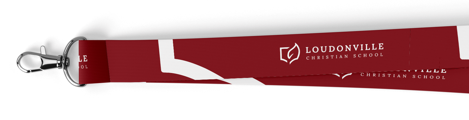
The goal of this project was to create a cohesive identity and brand standards for the school where none existed before.
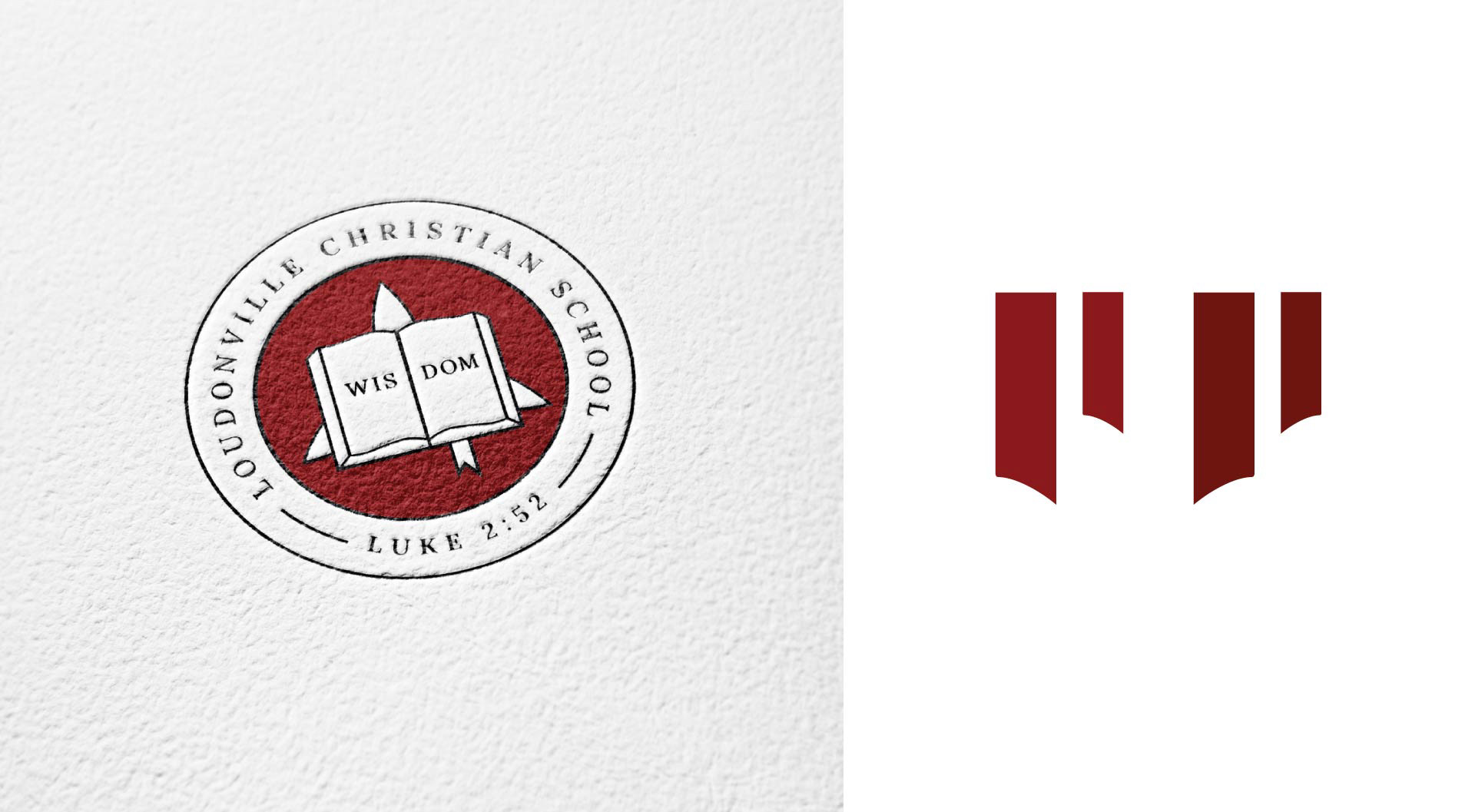
One of the school’s goals was to establish three distinct yet unified marks for each branch.
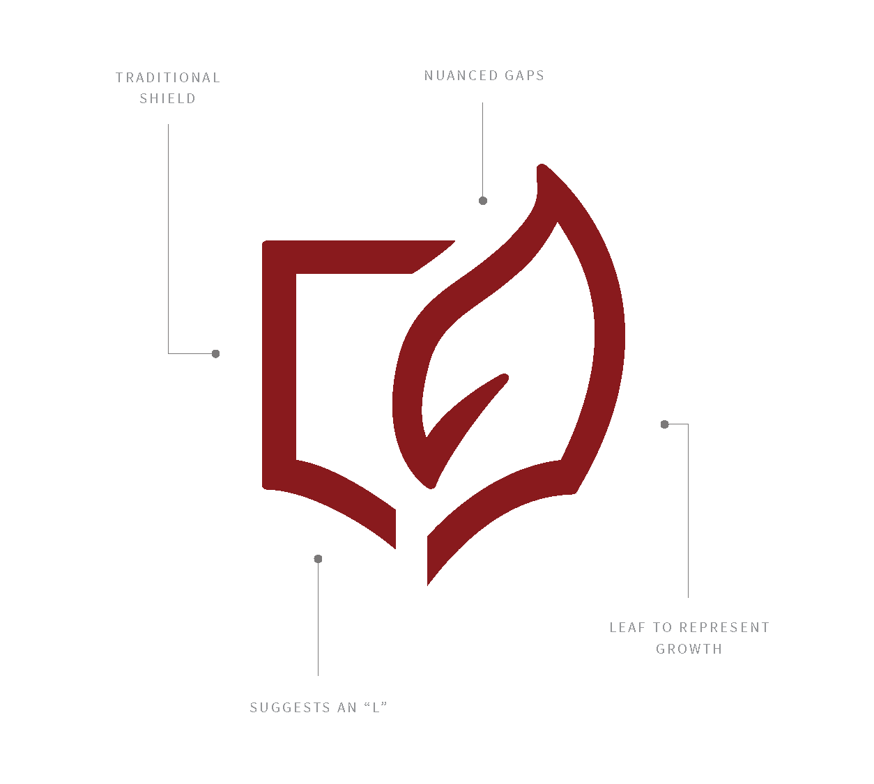
An L-like shield forms the base of each mark, resulting in a set of cohesive logos to represent students growing in the classroom, on the field, and on the stage.